The Art of Music: Side 2
Posted in Perfect print design on 21 April 2013
Here are a few more of our Doxtors thoughts on prominent albums to them. Russell’s album of choice is fascinating, a real example of the lengths you can go to in order to present something above and beyond the norm! Steve’s is a real insight into how the introduction to a certain type of music can stick with you for years to come. Then we have Nicks thoughts, which are well to the point!
Spiritualized – Ladies and gentlemen we are floating in space (Limited edition black version) by Russell D
This is a limited edition black version of the original 1997 release. The album packaging was designed to resemble a prescription medicine box. The attention to detail is incredible, each album comes with 3 discs, one of which is packaged in a foil blister pack! Each of the pill style trays were packed under strict pharmaceutical manufacturing conditions – I’ve not popped open the foil of mine and never intend to, the design is just too good to damage! Credits were printed onto a dosage advice sheet that also included warnings on the possible side effects of listening to the band.
When originally released in 1997 there was a 12 disc, 3 inch CD limited edition album – each of the 12 tracks were individually contained in their own foil blister pack!
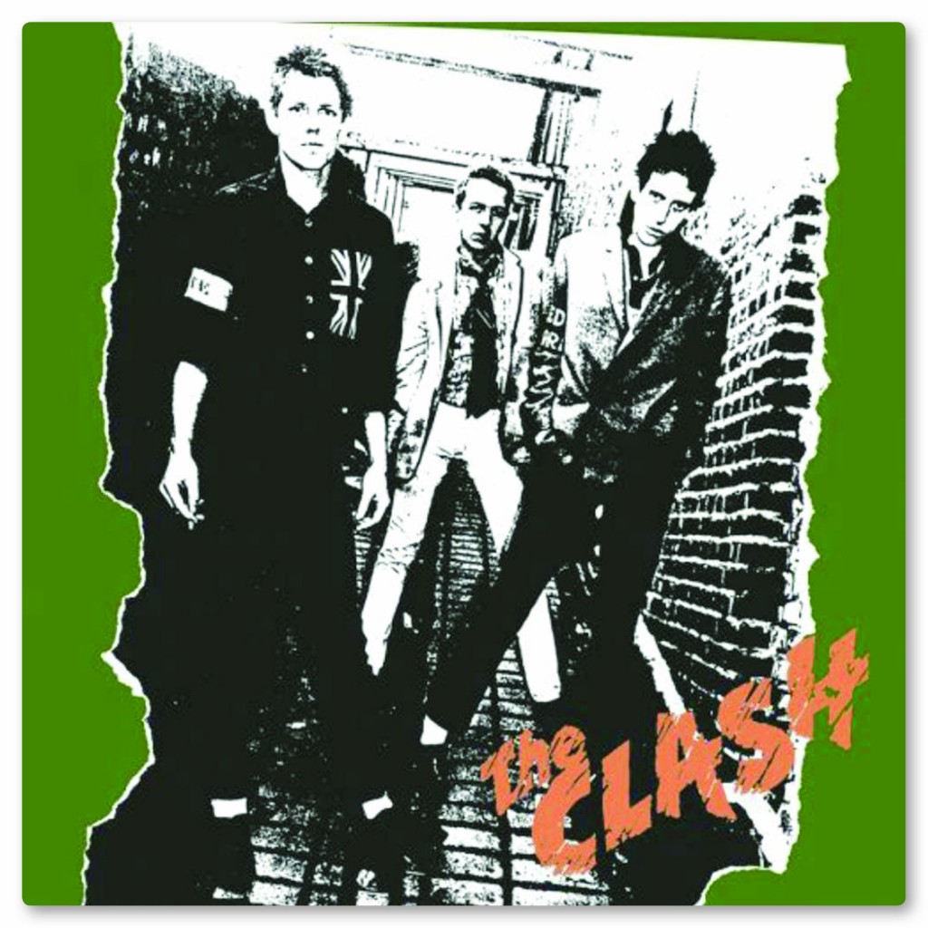
The Clash by Steve C
It’s like it was yesterday. My secondary school, a lunchtime record club in Mr. Ablett’s Art room. Age 13. An intimidating 5th year boy applies the needle to the vinyl and suddenly there is an explosion of noise unlike anything I had ever heard before.
 This was my first introduction to the first self titled album by The Clash and from that very moment, I felt a calling to the Punk and New Wave genre. I hot footed it down to the local Record House, bought my own piece of Punk heaven and proceeded to wear out the grooves on it. From Joe Strummers lyrics, barked out with the ferocity of a jet engine, to Paul Simonon’s throbbing bass lines and Mick Jones inventive punchy guitar riffs. An LP that screams a youthful arrogance synonymous with the times. The Album cover itself conveys a snarling disaffection of youth of which The Clash were the pied pipers of the time. I just wanted to be the guy on the left!!
A band starting on a journey with a raw energy sculpted by their working class West End environment. A political band that embraced multi cultural sounds and pioneered punks anti racist calls. A band that would take America by storm by constantly evolving their sound but maintaining their originality and realism.
I have albums that I rate higher than this, but this is the one that set me on a lifelong passion for music, and as a thirteen year old to hear it for the first time was like being born in to a whole new world again.
Finally, to finish, a few very …umm… very in-depth thoughts from Nick!
Jamiroquai. Rock Dust Light Star by Nick E.
Few words needed here really. 1 – A new album by Jamiroquai… 2 – Neon Lights… 3 – Cool hat!
Thanks to Russell, Steve, Nick and all the Doxtors who got involved. It’s amazing how music can inspire peoples passions and creativity. Long may the record store survive, and the beautiful album covers that go with it. Don’t forget, we’d really love to know your thoughts!