5 easy ways to style a dissertation cover
Posted in News on 16 February 2022
You’ve spent what feels like a million hours researching, reviewing, and typing your dissertation, and it’s finally ready, all laid out nicely in your chosen publishing app. (If it’s not – please feel free to look back at our previous blog post guide to writing your dissertation or 5 tips for thesis writing).
Now you need the icing on the cake, a cover which says you mean business – and you need to put some thought into it. After years of printing hundreds if not thousands of dissertations, we feel we have a little bit of knowledge about how to help.
The obvious stuff
Ok, so all thesis/dissertation covers need specific info required by your university, usually but not limited to:
- The title
- Subtitle if there is one
- Your name
- Your course and course code
- The department/faculty/tutor name
- The date of submission
- Word count
Ideally these will be clear and easy to read, with no spelling mistakes (it happens!). You will need to check whether there are specific guidelines from your university that you need to bear in mind, font size, margins and spacing for example.
At this point it might be good to mention that we are probably not talking to the Graphic Design students among you – we really hope that after years of studying your craft, designing a cover will be the chance to showcase your talent, and push the boundaries a bit. If you want to go old school rainbow text with a fisheye warp in comic sans, you go for it, they wouldn’t expect anything less! If however, design isn’t your thing, keep reading.

1. Choosing an abstract image
You can go simple and just have a full colour background – the last thing you want to do is make the cover too busy.
However, there is no reason why you shouldn’t use one or two images. Some photographs can work very well as an abstract or textured background – think fabric for textiles students or magnified molecules for science. Although if you’re a food science student, avoid a close up of vegetable soup as a background (TV vomit!). This is a really good way to make your cover look interesting whilst using an image that means something relevant. You don’t have to buy an image, there are some great free stock image resource websites such as pexels, unsplash and pixabay.

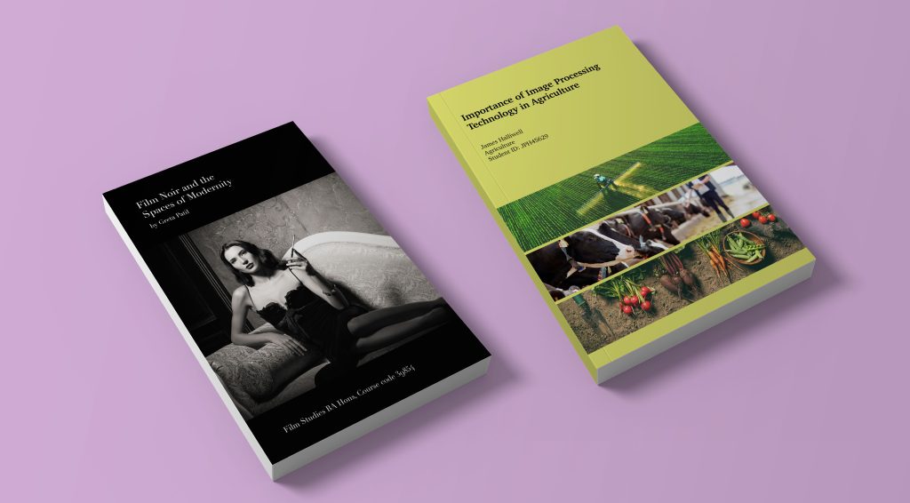
2. Using photos to engage
Instead of using generic abstract images, you could use photos that actually describe your topic of discussion. Don’t be afraid to play around with layouts, use one photo, or several.

3. Illustrative
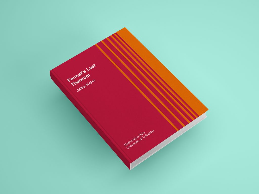
There are many ways that you can give the cover a more illustrative feel, and you don’t need to be good at drawing. Even dividing the page up and using sections or lines of colour can help it to stand out. Here’s one that has bands of red reducing gradually over an orange background, (or orange stripes gradually being spaced out over a red background!) for a maths dissertation. No special programme or apps needed – it’s just down to drawing a few rectangles.

4. Typographical
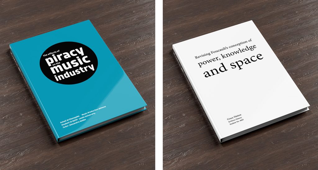
You can use your title as the main design feature of the cover. Again, you don’t need to be a graphic designer to make it look pretty. Choose a good font, there are hundreds of free font websites out there, some of them are good, some of them are awful. We recommend Font Squirrel or Dafont. You will need to check the usage terms for licensing the font, but as your font will not be used for commercial reasons, it’s not usually a problem. Here are two examples of the titles laid out in an impactful way.

5. Simple
Lastly, if you don’t have the means to create a stylish cover, don’t panic! When you upload your book to print with us you can use our cover design tool. There are some helpful videos here to show you what to do, and you can have the perfect book in your hands in just a couple of days. Good luck!